QueensBallroomDance
A client website redesign to improve the information architecture and overall user experience.

Client
Queens Ballroom Dance
My Role
UX Designer
Key Skills
User research, research synthesis, user personas, storyboarding, task flows, sketching, wireframing, prototyping, usability testing
Project Length
6 weeks


About QBD
Queens Ballroom Dance (QBD) is a dance studio in Queens, New York that offers ballroom dance lessons for all levels and ages. QBD aims to serve the dancing community in Queens by providing the best quality dance instruction in a warm and welcoming atmosphere.
Why Redesign?
Although QBD’s current website is informative, there is too much information and no clear information architecture, leaving the user confused when searching for essential information. There are also accessibility issues on the navigation bar. The current website also needs to be redesigned to have a more aesthetic and elegant design in to match the business' brand values of elegance, sophistication, and regality.
Current Homepage

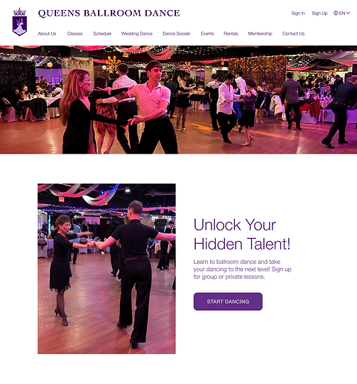
Redesigned Homepage
Understanding the Problem
Step 1 - Website Audit of Current Design
To being the research process, I went and analyzed the current website and identified some existing problems. Below are a few examples of issues I identified.


Step 2 - Client Meeting
Next, I initiated a client meeting with one of the business owners to hear from him about the areas for improvement and discuss the overall scope and goal of the project.

Meeting Summary:
Objective
Restructure the hierarchy and information architecture of the current website so that information is easily identified, responsive, and improves SEO
Business Goal
Increase leads from the website by highlighting what the business offers and enticing users to come into the dance studio
Target Audience
Dancers of all ages and levels in the Queens community
Step 3 - User Interviews & Usability Testing of the Current Website
In order to gather insight into the current website's pain points and empathize with the users' needs, I conducted usability testing on the current website and interviewed 9 of the business' current dance customers. I also sought out and interviewed 5 prospective customers who were interested in signing up for dance classes. The participants ranged from ages 21 to 69.
Customer Insights & Findings
I used affinity mapping to synthesize my research by organizing my data into categories and themes. I came up with many different groupings that helped me to understand the users' pain points and needs.

User Pain Points
There is too much information to read
The website design seems outdated and generic
User Needs
A special offer that would entice and motivate users to sign up for a dance class.
Not enough visuals or "eye appeal" to showcase what the dancing is all about
There is no class description or class policies
A Look at the Competitors
Now that I understood what I needed to redesign, I did a competitive analysis of other dance studio websites to see how they designed their site and approach the problems I was trying to solve. I chose these competitors because they were mentioned by my client and my interviewees. I looked at 5 competitors and took note of the business features that they provided.

From my competitive analysis, I saw 3 popular features that QBD was missing:
01
A mailing list service for first-time customers
02
Clear and actionable CTAs all throughout the website pages
03
Numerous images and videos showcasing the classes and dances offered
Defining User Personas
Based on my research, I discovered that QBD had 2 very different users with different needs. One type of user is Emma, a prospective dance customer who does her research about the dance class before committing to sign-up. The second is Paul, an advanced and regular dance client who wishes to take his dancing to the next level.


Storyboarding My Solution
Using post-its and a Sharpie, I created 2 storyboards to illustrate how my website redesign would align with the business and user outcomes.


Creating Task Flows
After deciding on the main actions that my user personas would take, I created 4 main task flows.

Click on image for better viewing experience
Sketching Possible Solutions
In my notebook, I sketched many possible designs. I made sure to focus on information architecture and incorporate lots of imagery and CTA buttons because these were the user's needs and goals. I also kept in mind my client's business goal of increasing leads from the website.


Digitalizing My Sketches
On Figma, I transferred my sketches into mid-fidelity sketches. I presented my wireframes to my client and made iterations based on the feedback I received.
Homepage

About Us

Dance Socials

Group Dance Class

Applying UI and Branding to Wireframes
Utilizing QBD’s branding, I used the same logo design, brand colors, and typography on my high fidelity wireframes. My goal was to stay consistent with the current branding but to refine the overall design of the website to look more sophisticated, regal, and elegant.
Style Tile
.png)
About Us

Dance Socials

Dances & Levels

Private Lessons

Prototyping My Solution
I brought my designs to life by prototyping my wireframes in Figma. Here is a prototype demo for buying a group class package, including a sign-up and checkout process.

Improvements After Usability Testing
Now it was time to test my designs and make any necessary iterations. I conducted my usability testing with 6 users who were either current customers from the dance studio or non-customers interested in learning dance.
Overall Feedback:
The usability testing was a success with lots of positive feedback about the overall redesign. There was only one major area to iterate upon. The checkout process was a point of confusion for users and the place where I made the most significant iterations.
Before


After
Before

After

Final Design Solutions
Redesign of the Homepage

Current Homepage

Redesign of the Class Schedule

Current Class Schedule

Instructor Page

Instructor Bio

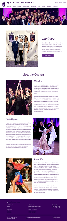
About Us Page
Dance Socials Page

Upcoming Events Page

Reflection
My Challenge
A challenge I faced while working on this project was meeting my timeline deadlines. I spent more time than expected working on my interviews, designs, and iterations. My goal going forward is to better manage my time and prioritize my tasks even if they are not done to perfection.
What I Learned
-
Communication & presentation. Through this project, I gained the experience of working with my first client. I learned how to work with and talk to stakeholders by presenting my work
-
Consistency in UI Design. I learned to stay consistent in my design with QBD’s branding by using their brand colors and typography all from beginning to end
-
Small iterations are powerful. Another big learning takeaway for me is that subtle iteration can make a big difference. For instance, one simple iteration that transformed my design was simply rounding the corners of the CTA buttons to make the overall design more welcoming and pleasing to the eye.
Back to top
See More of Annie's Work

