GoGeo Case Study
An educational learning app designed to help elementary school students learn geography in a fun, easy, and gamified way.
Project Role: UX Designer
Key Skills: Research, research synthesis, storyboarding, task flows, user persona, sketching, wireframing, prototyping, usability testing
Project Length: 6 weeks

The Problem
Many elementary school-aged students find it hard to remember the names of the world's continents, countries, and US states and capitals. A lack of engaging geography-related activities makes geography learning unappealing to kids, thus making geography fact recall a challenge for students.
The Solution
Bothered by this problem, GoGeo was a project I designed to be an educational learning app to help elementary school students learn geography in a fun, easy, and gamified way. The primary goal is to help students identify and remember the continents, states, and countries through interactive games.
Solution Preview
To solve the problem of uninteresting geography-related learning activities, I designed a tablet application that would make remembering the names of continents more engaging by taking a gamified approach. In this demo prototype, users are presented with:
-
A set of 5 questions that make up the quick game mode
-
A progress bar that shows how many questions are answered and how many questions are left
-
The option to use a hint button if users get stuck

Project Goal
To understand how teachers and students feel about geography learning in order to create a tablet application that helps students learn the subject.
Research Methods
16
Student
Surveys
To find out what students think about learning geography and school in general, I surveyed 16 third grade students. The student surveys gave me some common insights about the likes and dislikes of the subject of geography and learning in general.
5
Student
Interviews
Based on the insights gleaned from my student surveys, I conducted 5 student interviews with third graders in order to gain a more in-depht understanding of why geography was hard for students.
5
Teacher Interviews
To understand how teachers felt about teaching and learning geography, I conducted phone interviews with 5 elementary school teachers from NYC public schools. The teachers interviewed were either 3rd or 4th grade teachers.
Insights Discovered
After conducting my interviews, I used affinity mapping to synthesize my findings.

So, why is geography hard for students?
1
Students lack background knowledge about geography and do not relate to the subject
2
Students don't find geography interesting or engaging
3
Geography is hard for students because there are too many names and terminology to remember
Defining a User Persona
After synthesizing my user research, I created Andy as my user persona to identify my user goals, motivations, and frustrations. My user persona was useful in helping me design a product that would solve my user problem.

Problem Statement
How might we make learning geography for students easy, engaging, and a social part of learning with friends?
Design Exploration
I wanted to explore how other educational learning apps made learning engaging for their users. So I analyzed and studied the designs of Duolingo, Epic, and Netflix’s “Trivia Quest.” My goal was to look for design patterns, user flows, and features that I could assimilate into my own designs.


Competitive Analysis
Now that I knew my problem statement and what I needed to design for, I did a competitive analysis of 3 geography learning apps. My goal was to seek out gamification features that these apps implemented.
Gamification features of competitors that influenced my design:
Planet Geo

-
6 different interactive games to choose from, each focused on a different geography skill
-
3 different levels - easy, medium, and hard
StudyGe

-
See your ranking
-
Earn extra coins for consecutive right answers
GeoChallenge

-
Different player modes and game modes different geography skill
-
See your achievements
Visualizing by Storyboarding
Using post-its and a Sharpie, I storyboarded my user problem. My goal was to visualize and depict how my product could be used as an engaging and fun educational learning game.

Creating Essential Task Flows
I knew that designing a geography game would be my main task flow. But I also needed to consider other important user tasks for an end-to-end application. For that reason, I also designed task flows for the onboarding process as a student and viewing the leaderboard.

Click on image for better viewing experience
Sketching Possible Solutions
Now was the fun part of sketching possible solutions in my sketch notebook. I referred back to the design research I did on other app designs to incorporate design patterns, flows, and gamified features.

Digitalizing My Sketches into Wireframes
In Figma, I transferred my sketches into wireframes. My goal was to keep the interface simple and intuitive yet fun and engaging for students to use. This process was iterative for me and I went through a few rounds of iterations to find the best solutions for the flows and designs.
Profile Creation

Player Mode

Game Mode

Leaderboard
Game Screen

Developing a Brand Style
Mood Board
Before applying UI to my high fidelity wireframes, I created a mood board to gather inspiration for the visual design of my product. Next, I selected the typography, colors, and brand personality that I wanted my brand to embody. I experimented with several typography choices and two color palettes by applying them to my wireframes before determining the final style guide. I wanted the brand style to be fun, playful, and cute.


Style Guide
High-Fidelity Design Details
The Onboarding Process
The personalized onboarding process for a student in the classroom is easy and quick. A student would select "Student," choose how to enter the class code, and then enter the class code given to them by their classroom teacher.

Step 1:
Sign Up

Step 2:
Personalize the process. In this flow, it is for a student.

Step 3:
Select the method for entering a class code. In this flow, it is to manually enter it.

Step 4:
Enter the class code
Final Design Close Up


Gamification Features


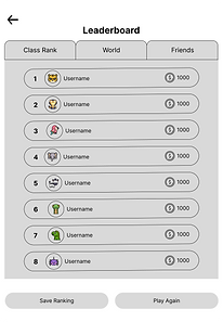
Leaderboard, Achievements, & Badges
From my research, I discovered that students enjoyed earning coins and competing with friends. For this reason, I included a leaderboard and screens that show their personal achievements and badges earned. My goal was to increase user engagement and motivate users to improve their progress.


Usability Testing with the Target Audience
I conducted my usability testing with 5 participants who were 3rd grade students at a public school in Queens, New York. My goal was to test the user-friendliness and appeal of the app in order to make further iterations to improve how usable and engaging the app is. I asked my participants to complete 3 tasks:
1.) Sign up for a student account by entering a class code and creating a profile
2.) Choose a player mode and play a quick game of “Guess the Continents”
3.) View the leaderboard, achievements, and badges


What Worked Well
Overall, the usability testing was a success. All of the participants especially liked seeing their ranking on the leaderboard, their achievements, and their earned badges. This feature gave participants a feeling of success and accomplishment. It also motivated them to keep performing well or improve their current position.


"It shows me how many badges I earned and I'm proud of myself."
"I like how you have the ranking and achievements and badges that you have because you can see how much did you improve."
"I like the color a lot. I like the illustration of the earth with the sunglasses on it."
"I will play this game again because this is about geography and I'm bad at geography. It will teach me a little about geography."
What Didn't Work Well
In the first task, 4 out of 5 of the participants struggled with the sign-up flow of creating a student account. Based on the frequency and severity of this error, there was only one main area of improvement to be made, which was to change the copy of the main CTA button.
Before

It was confusing for students to have the main CTA button as "Get Started." Students naturally clicked the secondary CTA button "Sign In" when asked to create an account.
After
My solution was to change the copy of the primary CTA button. My thought was that this would further clarify the difference between signing up and signing in. To further iterate that this was a learning game, I added the tagline "Ready to play and learn geography?"

Challenges Faced During the Project
User Interview Challenges
Although I had built rapport with the participants before the interview process and thoughtfully crafted my interview questions for my target audience, the interviewing process was my biggest challenge.
-
Getting the participants to elaborate and explain their answers to my questions was an unexpected challenge
-
Participants would respond with “I don’t know.” I found myself prompting the participants often to say more without leading them on and repeating their answers in order to clarify and understand.
Future Scope
Based on the feedback I received from my usability testing, here are a few ideas that I would like to implement and test to further develop this app:
-
Add more games to play
-
Redeem the coins earned through a shop
-
Message and chat with your friends on the platform
My Personal Learnings
1.) Design practices for iPad
By designing for iPad on this project, I learned some best practices. Here are some key things I learned:
-
The screen display for iPad is large, and this led me to explore ways to fill up the screen with bigger images and make use of negative space
-
iPad uses touch gestures rather than clicks from the mouse
-
How to use appropriate text size and button sizes
2.) Gamification in UX design
I learned that gamification features like the leaderboard and earning coins motivates and excites user engagement, leaves students feeling proud of their accomplishments, and motivates them to improve their learning.
3.) Designing for a young audience
I was challenged to make the interface educational yet interactive and engaging for elementary school children to play. I found myself thinking from the perspective of a student as well as a teacher often while creating my designs. This project also stretched me to think about the visual branding of my app that would appeal to kids.
What I Could Have Done Better
Design for iPad in landscape mode
While building my designs, I realized that it might also be a good idea to design for iPad in landscape mode. Since I started my designs in portrait mode, I continued designing in portrait mode from beginning to end. I would also have like to increase user engagement by incorporating cool features such as adding animations and sound effects to amplify the entertainment and engagement factor.
Back to top
See More of Annie's Work
.png)
